
How to make the coolest Hockey Bar Chart?
Introduction do Hockey Data Visualization with Matplotlib

Data Analytics is becoming more and more important in sports and we see more and more graphs in sports articles. SB Nation blogs, EliteProspects’ EP Rinkside, Sportsnet, ESPN, TSN, and The Athletic are among the hockey medias consistently using additionnal data and graphs in their analysis.
If you are a blogger trying to incorporate hockey graphs in your articles or just a fan of Sport Data Viz, this article is for you. I am not an expert, but I will try to guide you the best I can. At the end, you will know how to make some cool Hockey Data Viz in Python, so let’s start.
We are going to find who were the best goal scorers of the NHL last season.
Do everything Patrick Bacon suggests you to do, until you arrive to this part, then go to “Start the tutorial”, then go to the next line
Import the packages
Do the next operation in the first cell of your Jupyter Lab Python file.
#Import packages

import pandas as pd #For Dataframe operations
import numpy as np #For number operations

#All those below are to make the data look good
import matplotlib.pyplot as plt
import matplotlib.ticker as ticker
Let’s find the data.
df = pd.read_csv("https://www.cse.msu.edu/~shomerha/hockey/pbp/nhl_pbp20212022.csv.gz", compression="gzip")
#Thanks to Harry Shomer for the Data :)

#Filter for goals regular season and non-shootouts goals
df = df[(df.Event == "GOAL") & (df.Date < "2022-05-02") & (df.Period < 5)]

df.head() #because I always like to have an overview of what the data looks like after manipulating it
Harry Shomer stored the NHL’s play-by-play data scrapped on his website, so this is what we are fetching in the first operation. After, we are filtering for 3 different things : events that are GOALS, events that happened before the playoffs (2022-05-02) and we are trying to get non-shootouts (period 5) goals.
Function that will be useful later
def small_name(name: str):
    """
    For players with only one first name and one last name
    """
    new_name = f"{name[0]}. {name.split(' ',1)[1]}"
    return new_name

small_name("Max Pacioretty")
This function basically returns a Player name that fits the requirement (1 firstname, 1 lastname) into a [First letter of firstname]. [Lastname] format. You can try it with your name if it fits the requirement. It will be useful in the future because we will want to have something shorter than the full players names to identify them. You will see why later :)
Let’s do more data manipulation.
#Make a new df using groupby(). This group by every player and count how many times they have an Event (which is a goal here) in the event column. I am also sorting the Dataframe to have the best goal scorers on top and I am reseting the index because I'm a perfectionnist.

pd.options.mode.chained_assignment = None #Need Pandas to trust me on this and not give me a warning

goal_leaders = df.groupby(['p1_name', 'p1_ID'], as_index=False)["Event"].count().sort_values(by="Event", ascending=False).reset_index(drop=True)
goal_leaders.columns = ["player", "player_id", "goals"]


#Dataframe with top5 players
top5 = goal_leaders.head(5)
top5["name"] = top5["player"].apply(lambda x:small_name(x)) #Because you don't want a the full name, trust me, it's too long and ugly

top5
Here, we do a bunch of data manipulations to make our final dataframe look good. We start by telling Pandas to not give us a warning for what we are about to do. Then, we do an operation to count how many goals each player has and generate a new dataframe with it. The new dataframe is sorted to have the highest values on top. We rename the columns to make the new dataframe look better. Since we want to have the first 5 players of the dataframe, we create a new dataframe with the first 5 players and we apply the function we’ve made earler to make the names be shorter. We could’ve done it with more than 5 players, but you can also do it by yourself.
We are now ready to make the Viz
top5.plot.bar()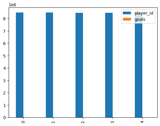
It’s not what I wanted…
Let’s make the viz try #2
def make_viz():
    fig = plt.figure(figsize=(4, 2.5), dpi = 200)
    ax = plt.subplot(111)

    ax.bar(top5.player, top5.goals)
    plt.xticks(rotation=90, ha='right') #so you can see labels

    return plt.show()

make_viz()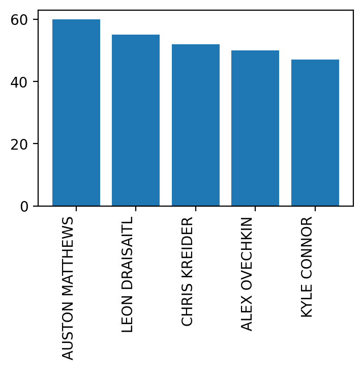
Hmm… it is getting better.. but now you understand why big names are bad. Also, I know I am going a little fast, but don’t hesitate to ask me questions are try to tweak my parameters. There are multple things you can do to make the graph look better (like adding colors, changing fonts, removing spines, adding a grid, etc. … BE CREATIVE and don’t hesitate to try things). It is by trying yourself that you will get better.
The fig, ax syntax is just a famous way of plotting in matplotlib. There are other ways to do it (like there is other ways to come up with the exact same graph in Python) and I do not know why it is like that, but don’t hesitate to look at the extremely complicated documentation of Matplotlib if you have any specific questions about it.
We can do better
def make_viz():

    #Create the figure
    fig = plt.figure(figsize=(4, 2.5), dpi = 200)
    ax = plt.subplot(111)

    #Make a few adjustments to make the Viz look better
    ax.spines[["left","top", "right"]].set_visible(False)
    ax.axes.get_xaxis().set_ticks([]) #Remove ticks labels because you will see why later
    ax.tick_params(axis=u'both', which=u'both',length=0)


    #Add the grid
    ax.grid( visible = True,
    lw = 0.75,
    ls = ":",
    color = "grey",
    zorder=1
    )

    #Make the bar chart with different colors (randomly picked)
    ax.bar(top5.player, top5.goals, zorder=20, edgecolor=["tab:blue", "tab:orange", "tab:green", "tab:red", "tab:purple"], hatch="//", fill=False)

    #Add the text since we removed ticks labels earlier
    for i, c in zip(range(len(top5)), ["tab:blue", "tab:orange", "tab:green", "tab:red", "tab:purple"]):
        ax.text(i, top5.goals.iloc[i]+2, f"{top5.name.iloc[i]} ({top5.goals.iloc[i]})", size=4, ha="center",
               color=c, fontweight="bold")

    #Add title
    ax.set_title( "Best goal scorers of the NHL in 2022", y= 1.1,size=12)

    #Add your name
    plt.figtext(0.9, 0.01, "Viz made by @woumaxx", ha="right", fontsize=3, bbox={"facecolor":"orange", "alpha":0.5, "pad":5});
    #plt.savefig("tuto.png", dpi=600, facecolor="w", bbox_inches='tight')

    return plt.show()

make_viz()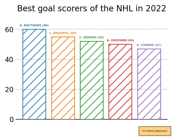
Isn’t it better? But we can give it more personality…
Here we have colors, we have removed the spines and the ticks labels. If you have no idea of what spines and ticks are, you are like me about 3 months ago… and I suggest you to understand what they are as soon as possible. Learning the components of a graph are essential to personalize your graphs and give the best end result. I promise you that the day you understand what those concepts are and you might realize the full potential of using Matplotlib for your Viz.

Let’s give our viz more personality
def make_viz():
    with plt.xkcd():  #To give the data more personality
        fig = plt.figure(figsize=(4, 2.5), dpi = 200)
        ax = plt.subplot(111)

        ax.spines[["left","top", "right"]].set_visible(False)
        ax.axes.get_xaxis().set_ticks([])
        ax.tick_params(axis=u'both', which=u'both',length=0)


        ax.grid( visible = True,
        lw = 0.75,
        ls = ":",
        color = "grey",
        zorder=1
        )
        ax.bar(top5.player, top5.goals, zorder=20, edgecolor=["tab:blue", "tab:orange", "tab:green", "tab:red", "tab:purple"], hatch="//", fill=False)
        for i, c in zip(range(len(top5)), ["tab:blue", "tab:orange", "tab:green", "tab:red", "tab:purple"]):
            ax.text(i, top5.goals.iloc[i]+2, f"{top5.name.iloc[i]} ({top5.goals.iloc[i]})", size=4, ha="center",
                   color=c, fontweight="bold")
        ax.set_title( "Best goal scorers of the NHL in 2022", y= 1.1,size=12)

        plt.figtext(0.9, 0.01, "Viz made by @woumaxx", ha="right", fontsize=3, bbox={"facecolor":"orange", "alpha":0.5, "pad":5});
        #plt.savefig("tuto.png", dpi=600, facecolor="w", bbox_inches='tight')

    return plt.show()

make_viz()
Now you have a cool viz you can show to your friends and family.
I hope you have enjoyed the ride. Don’t hesitate to ask me for questions, I am more than open to help the same way people still help me on a daily basis. The best way to get better is to practice and be curious. Also, never forget to look at what other have done to get ideas and never hesitate to try different Viz. The Data Visualizer is an artist at the same time as being a coder, a data scientist, a an analyst and most importantly a story teller.
If you need other tutorials, let me know what you want me to explore with you. Also, next Tutorials will assume you have beginner understanding of Python to follow. If you are not there yet, Youtube is full of free ressources to help you. My friends at FC Python can also help you to make you more familiar with Python using a Soccer theme. Also, let me know how I can improve my tutorials, it could be fun.
You can find the code on Github.
Thank you for reading and have a great day :) !!